Backstory
Orca Go is the app version of the company’s product Orca HCM, a complex enterprise product with 12 modules and over 150 features which were developed over more than 10 years. This project started in late 2016 as a collaboration with a Chinese partner that required us to embed a sized-down web app in their existing app, but ended up with us building a new and stand-alone app for our product.
Due to miscommunication between stakeholders, we didn’t realize that we had to make a new design for this project until March 2017, one month until the scheduled delivery to our partner.
At the time, I had only worked as an UX designer for 1.5 years, and I never designed for app before. What’s worse, I was the only designer on the team, and we didn’t have a proper “Product Manager” to lead the project.
And even as a sized down version, the app would still have over 40 features to be designed and built. No way we can do it in one month.
Since we’re going to design & build new pages for the web app, we decided to turn it into a stand-alone hybrid app for our product, and we opted for an open-source HTML5 framework with pre-designed components for fast implementation.
We used agile methodologies to speed up the design & development process; the goal is to deliver an MVP version first and then complete the full version with rapid iteration.
Research
As Orca HCM is already a mature product with tens of thousands of users, once we decided to make a new app, the requests for features flowed in from all aspects.
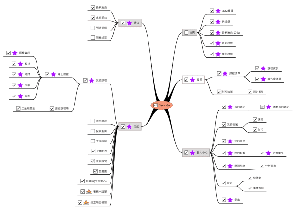
The initial site map looked like this:
To clarify what needs to be done, I used 3W questions to prioritize:
- WHO is the core user of this app?
The key users of our product are the 1) HR, 2) Managers and 3) non managerial Employees in a company, with employees as the largest number, who are required by HR or Managers to take online training courses, exams or performance reviews etc.
- WHAT problem do we want to solve for the users?
The fact that Employees don’t always have the time or devices needed to take the required trainings. Or they watched the courses on PC but forget all about it on the job.
- WHY would people use this app?
Although our web version has RWD design, a mobile app offers better experience for users to navigate and get resources from the platform any time any where, and thus improve their performance at work.
After analyzing user scenarios and usage frequency of features, I decided that the goal for MVP is: Users can complete the essential process of taking an online course on their phone, that is to search, enroll, participate and finish a course. Secondary process or irrelevant features will have to wait until future iterations.
Plan
Now that I’ve decided on the primary goal for MVP, I still need to discuss and communicate with other stakeholders to make the development plan.
The key people I talked to are:
CEO -- I needed to know the market strategies & business goal for this new app, if there’s something we should add to stand out from the crowd.
Tech Lead -- I needed to know the production capacity and capability of our engineer team.
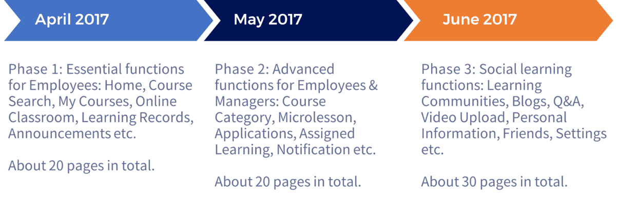
Being an enterprise software, it’s hard to talk to actual users, so I reviewed the user feedback on our web version for insights. Baring the user need, resource and business goals in mind, I kept about 20+ features to be developed in three phases, and presented the schedule to other stakeholders for agreement.
I studied the UI & UX design of other similar apps to see what are the popular designs and possible problems. In 2017, there weren’t many app for B2B or B2C learning platforms in Taiwan, so I sampled from American and Chinese products in the market.
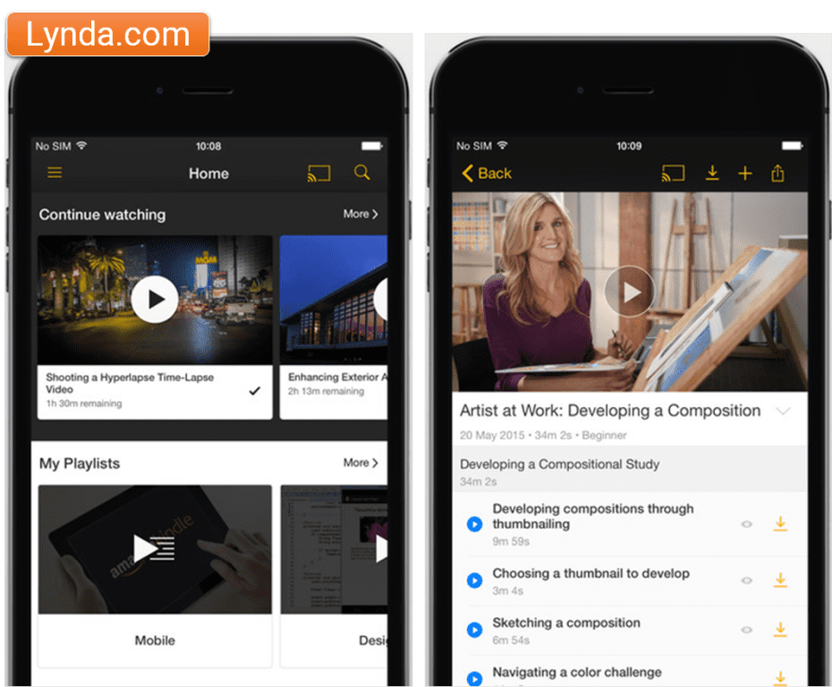
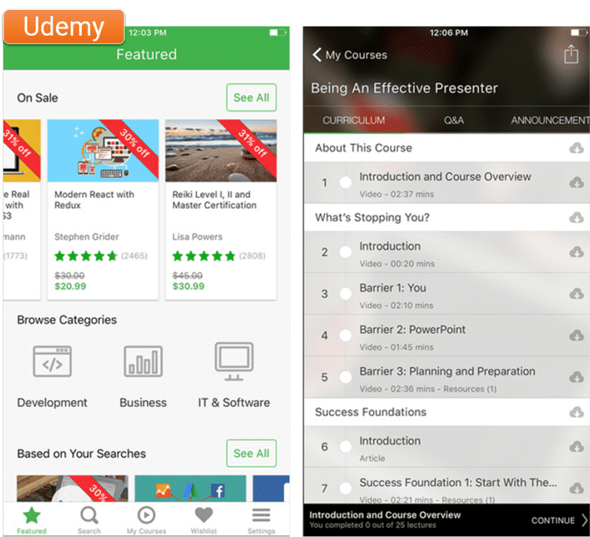
US: SuccessFactors, Lynda, Coursera, Udemy
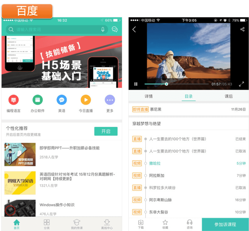
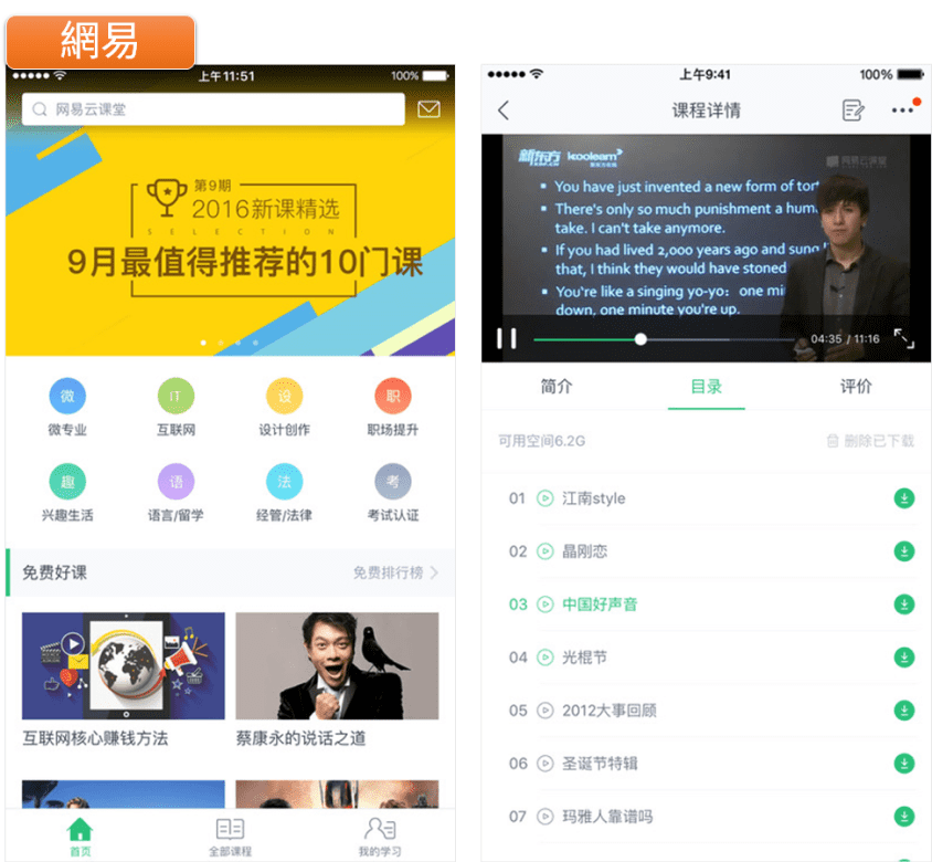
China: 百度传课, 网易云课堂, 知鸟, 慕課網
Take the Home page for example, there are obvious difference between American and Chinese designs:
US: Favors personalized contents, for example, "Continue Watching" appears on top of the page.
China: Favors administrator/manager perspectives, usually it's a big carousel with EDM on top of the page.
US: Fairly simple with a few tabs, relies mostly on Search function to navigate.
China: Quite complicated, in addition to tabs and menu, there's usually a "Quick Link" section on the Home page.
US: Uses both vertical and horizontal scrolls to make good use of the limited screen space and a better browsing experience for users. (This was 2017 after all.)
China: Places everything vertically, and users would have to scroll down (endlessly) to see the contents below.
US: Minimal. Black or white background with shades of greys, and highlighted with a primary color.
China: Colorful. Lots of different colors here and there, everywhere!
Design
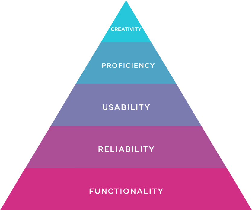
As our schedule was very tight, I usually had only 2-3 days to deliver the functional spec and interface design for our engineers to start working. So for the 1st iteration, the primary goal is to offer good functionality, reliability & usability, but not the pursuit of creativity i.e. whether it looks “beautiful” or not.
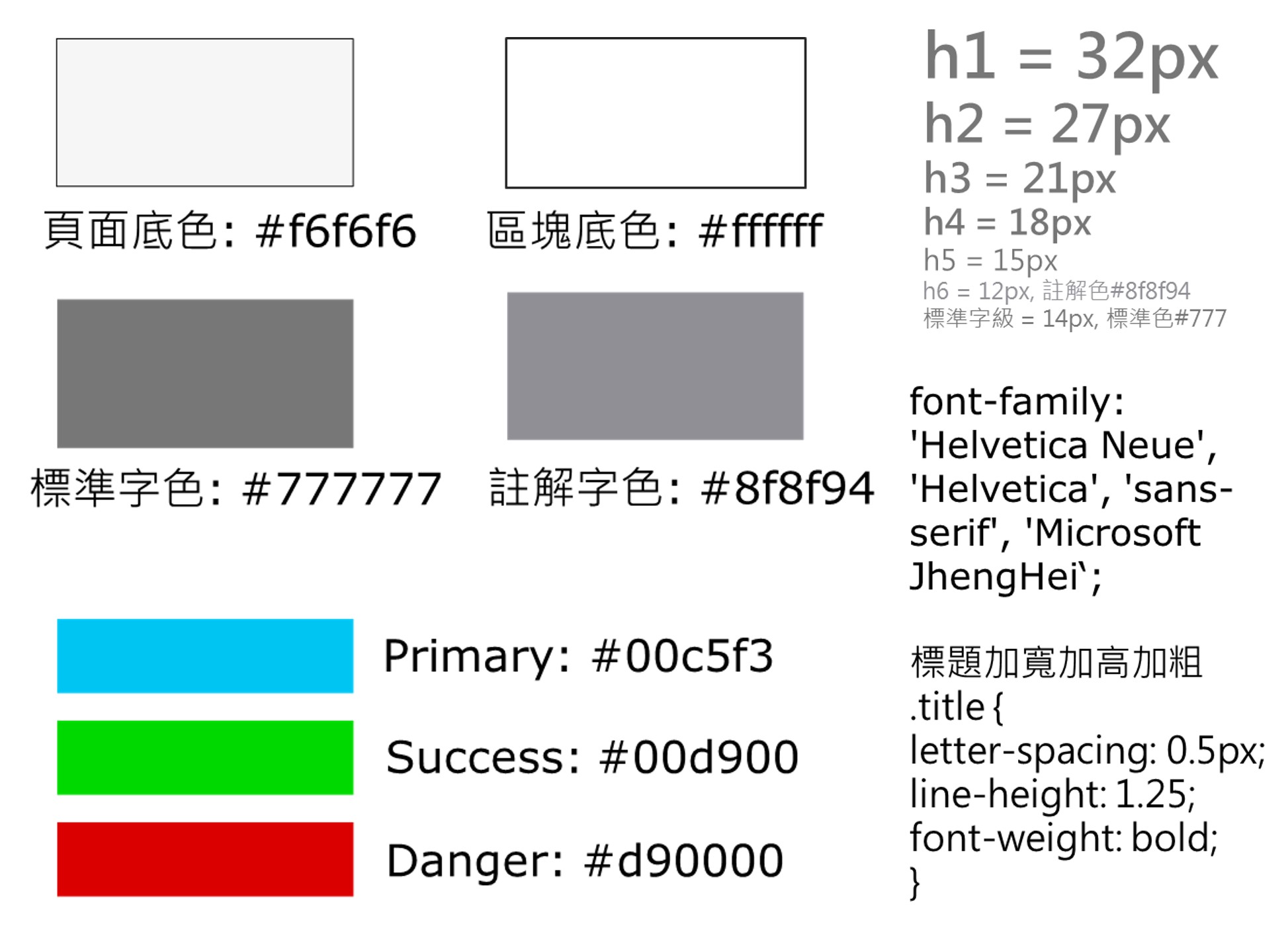
I chose simple colors that are similar to the web version for consist experience.
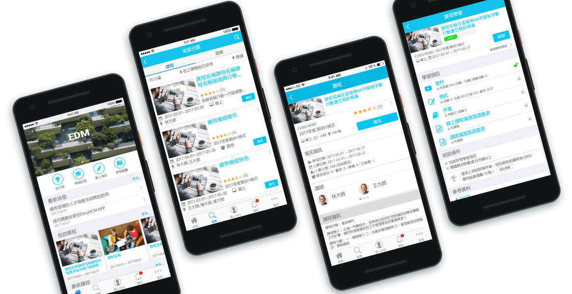
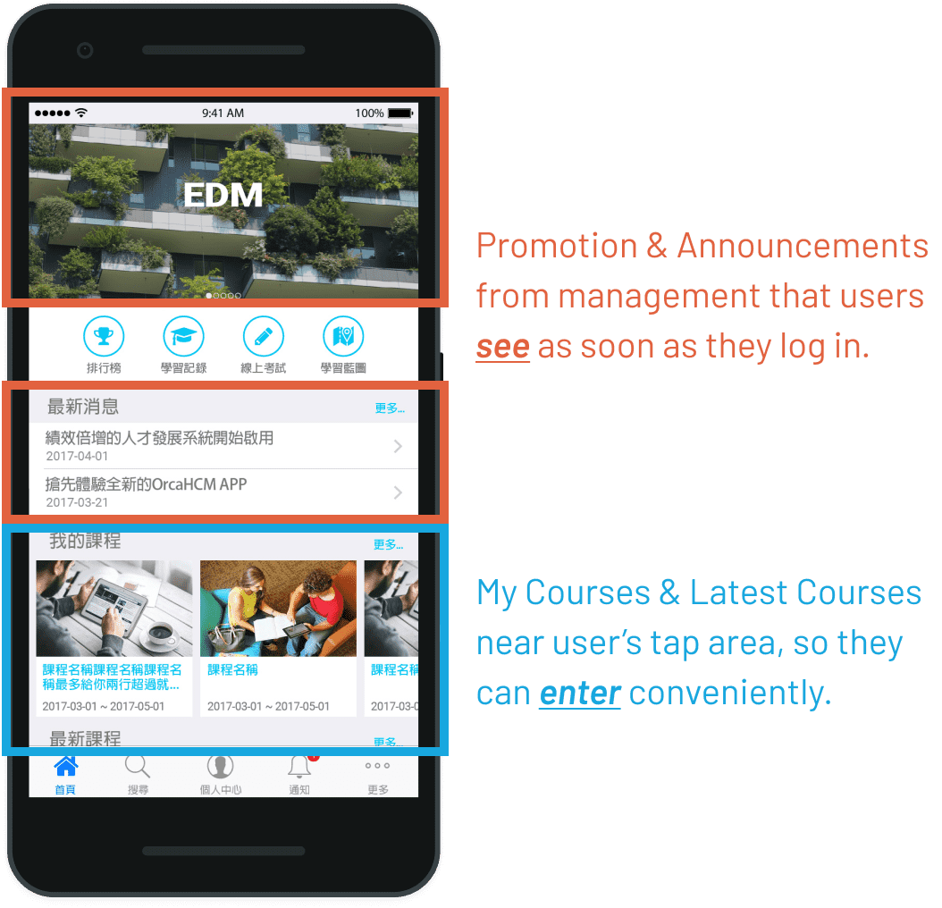
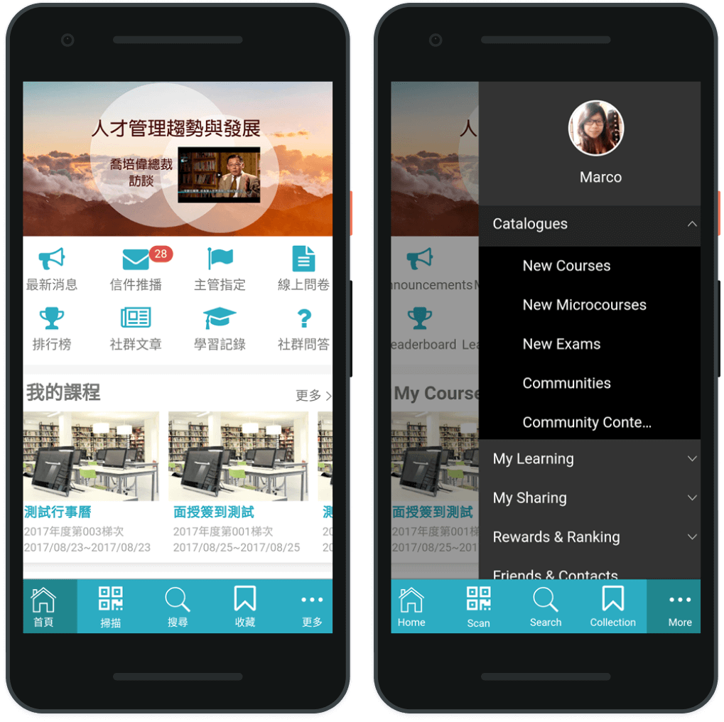
Home - I combined the strength of US and China designs to balance the needs of different user roles (Administrator vs. Employee).
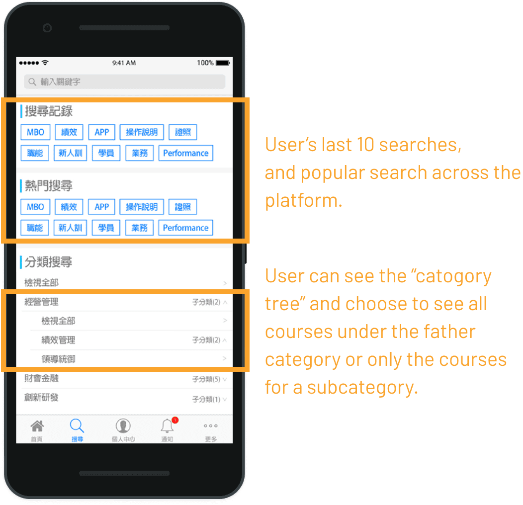
Search - Course category is heavily used by our clients, and we cannot predict or limit the quantity and complexity of the categories used. So, in addition to search by keyword, I needed to design an easy and flexible flow for search by categories. View prototype on InVision.
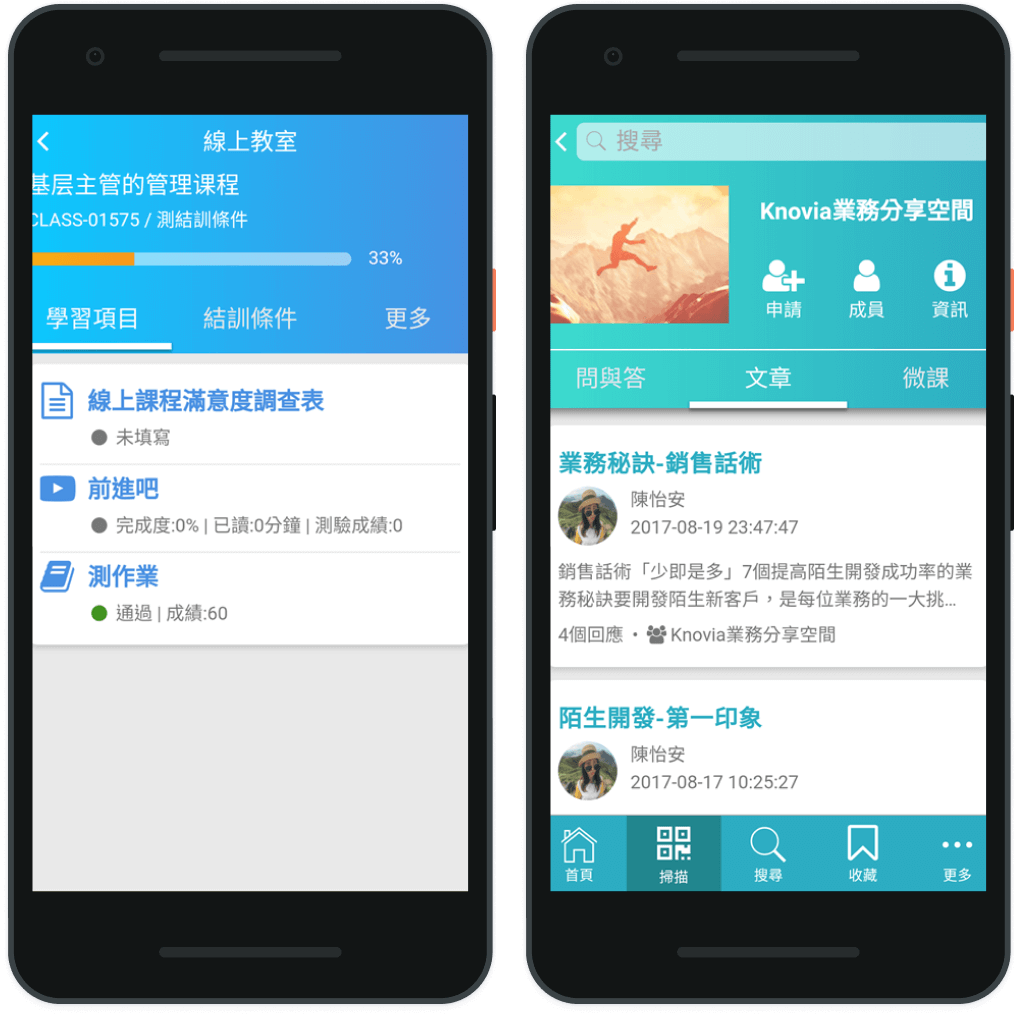
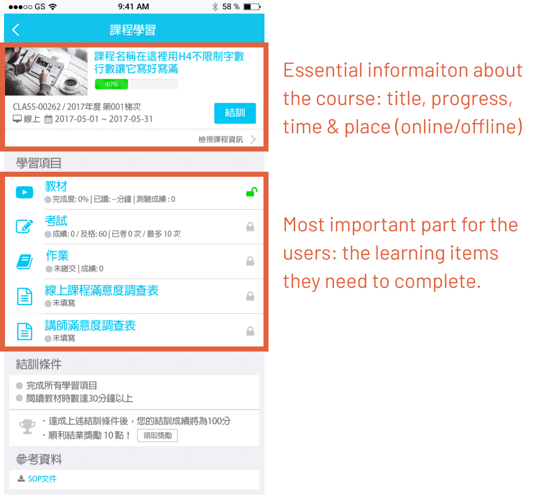
Online Classroom - To reduce user's learning curve, the layout is similar to web version, but as mobile screens are much smaller, only essential information is shown on the landing page of the classroom.
Deliver
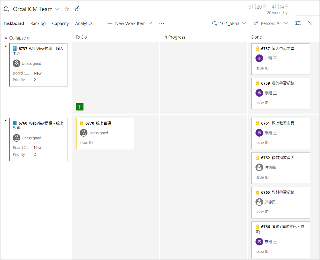
While I was still making the designs, I also have to follow up with our engineers & QA closely on the development & testing progress. We used Visual Studio Online as our Kanban management tool for the sprints, and in addition to stand up meetings, I also communicated with them directly whenever something came up, and carried out the UI & functional testing myself.
Although it was quite chaotic in the process, we managed to deliver the MVP in one month as scheduled. And then as we finally recruited new UI designers for the team, my role in the next iterations switched toward Product Owner / Design Lead, and I collaborated with our engineers and external contractor to launch the stand-alone Orca Go app in July 2017.
Since the release of the first version in July 2017, there had been multiple iterations and improvements made based on further user feedback, as we successfully attracted new and old customers in Taiwan & China to buy in or upgrade the system, such as Regent Hotel, Powertech Technology, Gogoro, etc.
You can learn more about the product on its official site here (in Chinese).